In what way does your media product use, develop or challenge forms and conventions of real media products?
Still Photo Frame
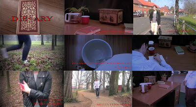
Still Photo Frame

Frame 1 (Top left): The Title of The film
The title is shown right at the end. The end of the opening sequence is accompanied with the closing of the diary to signify that the writer will return later to finish the book later. We gave the title a black outline to make it seem darker and more noticeable when the diary is in the background. The text instantly appears just before the fade to black transition to the diary then the fade to black occurs once more leaving just the Title and a black background. This is used to give emphasis to the titles power and significance. The contrast of red and black make the Title really look that much more appealing and menacing. The red from the text represents the blood shed with what is written in the author's diary.
The title is shown right at the end. The end of the opening sequence is accompanied with the closing of the diary to signify that the writer will return later to finish the book later. We gave the title a black outline to make it seem darker and more noticeable when the diary is in the background. The text instantly appears just before the fade to black transition to the diary then the fade to black occurs once more leaving just the Title and a black background. This is used to give emphasis to the titles power and significance. The contrast of red and black make the Title really look that much more appealing and menacing. The red from the text represents the blood shed with what is written in the author's diary.
Frame 2 (Top middle): Setting/Location
The first location shown to the viewers is Christian's office. This is where the murderer conducts his crimes so we thought we thought it would make a fitting establishing shot. We are establishing where and how the author kills people. The setting was decorated with props such as the diary itself and plants to make the scenery a homely feel. We also fitted black curtains to cover the sun light and make the shot look darker.
Frame 3 (Top Right): Costumes and Props
This shot shows one of the characters walking to a destination whilst looking smart and carrying a laptop bag. In this movie this character is considered the "smart guy" and we believe that we showed that to the audience with the use of costume and props. For instance, he is wearing glasses which would stereo typically infer that he is intelligent. He is also wearing smart clothing such as the suit jacket, cardigan and shirt, with a laptop bag which he is carrying like a suitcase. All these features come together to give the audience that the character is a smart and sophisticated individual.
Frame 4 (Middle left): Camera work and editing
The camera work and editing in this shot are matched effectively to build up a tense and dramatic moment. The shot presented in this frame is a still close up of the victim's feet passing the camera. We used our editing skills to cut to the point where she actually appears on screen and keep the shot going till she goes off screen, and then we move onto a different shot. We also used a video effect that darkens the edges of the screen giving the shot a darker and eerie feel to it. The camera work also influenced with the tension and build up to the scene by giving the sense of panic with the feet and keeping a sense of mystery by not showing the victims face in the shot.
Frame 5 (Middle Middle): Title font and style
The title font is shown not only at the end for the title but it is also shown throughout the opening and is also shown in this shot at the bottom of the shot. It shows the font we downloaded from "Dafont" and the name of it is "Hitman" We chose it because we admired its sharp edges and menacing appearance whilst at the same time being quite sophisticated. We wanted the font to match the personality of the author (Christian) and I think we did a good job in finding one that did. We didn't give the subtitled text black outlines as we did with the title text because we didn't want the text to distract the viewers too much from what is going on.
Frame 6 (Middle Right): Story and how the opening sets it up
The office scene does a good job in giving hints to what the story is about and setting it up. First of all throughout this scene there is narration which sucks the viewers in and grabs their attention. The narrator is the author and he briefly introduces himself and tells the audience what he is capable of which would then leave it up to the audience to ponder on what he is going to do with his powers.
Frame 7 (Bottom Left): Genre and how the opening suggests it
The typical use of blood in extreme horrors is present in our opening and frame 7 presents a scene which shows a vulnerable female running whilst bleeding. We have also avoided from showing her face to add some mystery. This is a typical scene that you could find in many extreme horrors. The stereotype that women are weak is often shown in horrors in general which is why we chose a woman to play the victim in the chase scene.
Frame 8 (Bottom Middle): How are characters introduced
The characters are all introduced individually walking to a certain location to meet up as a group. Each character has their own camera time as they are walking towards the location. In this frame in particular, it shows Tjay walking by himself to the location and you can already analyse his personality by just looking at his facial expression and his clothes. This gives the audience a chance to determine each characters personalities and stereotypes individually before they all meet up as a group. The group also expresses their personality with their body language and their voice as they meet up.
Frame 9 (Bottom Right): Special effects
The special effects used were subtle and sometimes quite unnoticeable. for example for frame we used a video filter to make it look that dark, the room was actually rather lit up when we were filming but thanks to some clever editing the shot looked like it was taken at night. It ultimately creates a dark and mysterious atmosphere to start the film off which is very effective for setting the mood of the film early on. We also used fade to black transitions in the office scene to make the shots blend well with each other and make the scene seem less choppy.
The special effects used were subtle and sometimes quite unnoticeable. for example for frame we used a video filter to make it look that dark, the room was actually rather lit up when we were filming but thanks to some clever editing the shot looked like it was taken at night. It ultimately creates a dark and mysterious atmosphere to start the film off which is very effective for setting the mood of the film early on. We also used fade to black transitions in the office scene to make the shots blend well with each other and make the scene seem less choppy.
No comments:
Post a Comment